


Starting point
Generic blister card, no brand identity
Blue gradient background, clip art illustration, no type system, no personality. Functional packaging that blended in everywhere and stood out nowhere.
The ask
Packaging Redesign — but first, decide who you're selling to
Before a single pixel moved, the brief expanded: eight fully developed directions, each targeting a distinct retail market, so the client could choose with strategy — not just preference.
THE BRIEF
The package hadn't kept up with the product.
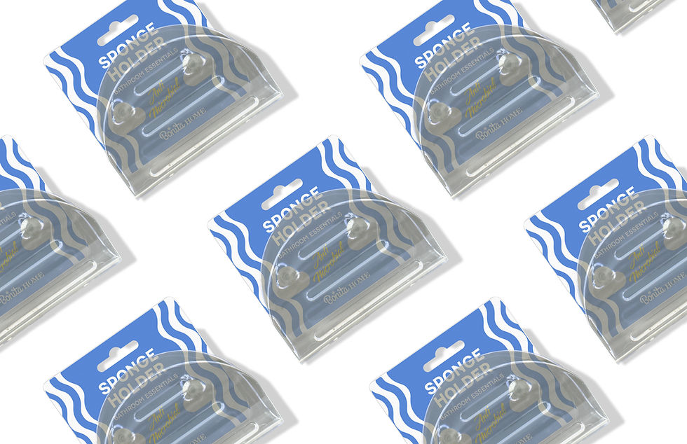
Bonita Home's sponge holder was a solid, functional product — anti-microbial, high-suction, impact-resistant. The kind of thing that does exactly what it says. But the packaging told none of that story. A generic blue gradient, a clip art product shot, no brand personality, no reason to reach for it over the identical-looking competitor two pegs down.
The client — a wholesale distributor with reach across multiple retail environments — knew it needed a change. The harder question was what kind of change, and for which customer. That's what the work set out to answer...

Starting point
Generic blister card, no brand identity
Blue gradient background, clip art illustration, no type system, no personality. Functional packaging that blended in everywhere and stood out nowhere.
The ask
Packaging Redesign — but first, decide who you're selling to
Before a single pixel moved, the brief expanded: eight fully developed directions, each targeting a distinct retail market, so the client could choose with strategy — not just preference.
Ideas & Sketching


Ideas & Sketching
The Process
Eight arguments. One winner.
Each concept was built around a specific retail context and consumer — not just a visual style. The question driving every direction was the same: who is picking this up, where, and what does this packaging need to say in the two seconds before they decide? Working within a fixed spec — the same 3.66 × 3.35 in blister card format throughout — made the differences between directions meaningful. Same canvas, eight completely different answers.


C-01
ICON & NAVY
C–02
Bold Stripe
C–03
Wavy Pop
C–04
Zebra Wave
C–05
Aurora Gradient
C–06
Water Drop
C–07
Flow Wave
C–08
Anti-Micro Hero
Selected direction — Concept 3
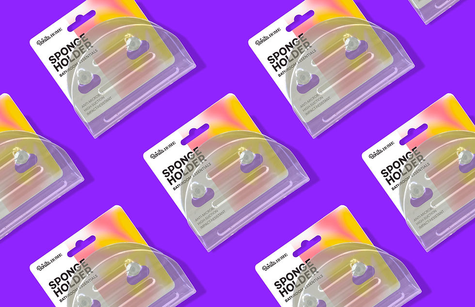
Wavy Pop — Full Bleed Color
Full-bleed solid color fill · repeating wavy stripe pattern · script "Anti Microbial" badge
The client chose the direction that committed most fully to being a brand — not just a package. C3 covers the entire card in a bold solid color with a repeating wavy stripe motif, nodding to water and cleanliness without being literal about it. The script "Anti Microbial" badge is treated as a design element rather than a disclaimer — it sits center card as a mark of quality. The Bonita Home wordmark anchors the bottom. Nothing apologizes for itself.
Critically, the color system was designed to flex: the same wavy pattern and type treatment works across red, yellow, blue, and green colorways — meaning the brand can expand across SKUs and product lines without losing visual cohesion. The choice wasn't just a look. It was a scalable system.
C-01
ICON & NAVY
C–02
Bold Stripe
C–03
Wavy Pop
C–04
Zebra Wave
C–05
Aurora Gradient
C–06
Water Drop
C–07
Flow Wave
C–08
Anti-Micro Hero
Built to scale from day one.


Why this one made sense.
C3 won because it solved the right problem. The client's existing packaging was invisible — it didn't register on shelf because it had no point of view. C3 has a very clear point of view: it's bold, it's color-forward, and it reads as a brand rather than a commodity. From six feet away in a retail aisle, it stands out. Up close, the script badge and wordmark give it enough craft to feel intentional.